2017/09/17

Revised Appearance Controls

You may recall seeing these control buttons in the lower-left corner of your FileMaker Pro windows:


  • The first 3 (100, –, and +) controlled the zoom. You clicked on + to zoom in or – to zoom out, and the number showed you the magnification factor.
  • The box with the gray bar on top allowed you to toggle the top-of-the-screen status bar on or off.
  • And of course the drop-down menu (shown here with “Browse” selected) let you specify which mode you wanted to be in. (You were also able to do so from the View menu or by using the keyboard shortcuts ⌘-B, ⌘-F, ⌘-L, or ⌘-U, respectively.)

None of those clickables are there any more in FileMaker Pro Version 16.

To take their place, I’ve established 3 appearance controls, 2 of which are available at the far right of most data-entry screens:


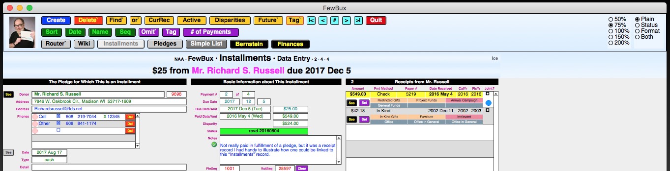
Let's look at those 2 in close-up:


That’s the Zoom control on the left; it works the way it always has, by letting you specify the magnification factor with the click of a button (in this case, a radio button). The View control, on the right, will bring into view either the status bar, the formatting bar, both, or neither (plain).

The 3rd appearance control, Window, determines how windows will be sized as you navigate to them. Unlike Zoom and View, it’s not shown on your data-entry screens. Instead, you need to go to the Router screen, click on info about “This Particular File” and page forward until you get to this screen:


Whatever value is set for each file on the host computer will automatically be in effect for each guest user who opens that file over the local area network (LAN). However, each such user can thereafter independently control the Window setting on her or his machine without affecting anyone else.

I’m toying with the idea of making the Window control, too, available on each data-entry screen. Let me know what you think in the comment area below.

2017/09/14

Top Navigation Part

New Home for Buttons

I've always put action buttons at the top of the screen, where they're easy to find. But they always had to go into a layout part that was primarily intended for some other purpose (such as display for the header part or data entry for the body part). Now FileMaker has made available a new type of layout part called "top navigation", which is the natural home for buttons. Here's where you'll find it on data-entry screens, right below the status and formatting bars:


Unlike the rest of your layout parts (header, sub-summary, body, footer, trailing grand summary, etc.), the top navigation part does not zoom, scroll, or print. It stays exactly the same size in exactly the same reliable position (at the top left of the window) no matter what you do elsewhere.

Input Screens

Here's what a data-entry screen looks like normally:


Here it is with the rest of the layout zoomed out to 75%:


Here it is zoomed in to 150%:


Normal zoom but with window narrowed and most of it scrolled toward the right:


And here with normal width but shortened vertically and scrolled down:


Output Screens

Top navigation is of particular value on output layouts, where I always had to try to cram non-printable buttons into the top margin of the page while dodging around printable text. This was particularly true of label layouts, where the top margin was only half an inch, and I needed half of that for the page title, so I had to string things out horizontally:


In the above image, the red line shows the right edge of the 8½×11 printable page as seen in Browse mode, and the green line shows how much farther I had to extend the layout to get all the buttons and explanations to fit. Of course, none of those showed in Preview mode, which showed things as the same width they'd appear on the printed page:


But look how much more compact things become due to the added vertical elbow room made available by the top-navigation part. Now even in Browse mode you get a good visual feel for how wide the output will be:


In Preview mode, of course, it looks exactly the same as before.

And now I'm able to add design elements for which I never previously had any space, such as the table name, aqua navigation buttons, and a text reminder of what kind of labels to use. Of greatest value is space for the new purple "?" (help) button and the 3 adjacent fields that it explains:
  • Header Type (blank, contact person, customized, or the word "Principal" for schools)
  • Custom Header Text (where, if the "Header Type" was "Custom", you could enter things like "To the parents of")
  • Covivant Preference ("Single" for just the name of the person on that record or "Joint" if that person's covivant should be included as well)

2017/09/13

Improved Help Buttons

I've been using little purple "?" buttons to indicate that help is available for whatever's nearby:


Clicking on the button would bring up a dialog box:


But the default size for the dialog box was limited, so if the text of the help message was extensive, I had to break it up into a series of installments, and you had to keep clicking on "More" buttons until you finally got to the last one, when you could get back to work by clicking on "OK":


And you had to go thru them all, even if you'd learned everything you needed to know after the first 1 or 2. Furthermore, I was limited to only one font at one size and could only emphasize things by using ALL CAPS. And there was no way to include pictures to illustrate what I was trying to explain.

Enter the popover button. It looks the same as before:


But clicking on it opens a whole new style of window:


I've got control over the size and shape of the window as well as its contents. I can put into it not only formatted text but also graphics, data-entry fields, and buttons. I'll be gradually replacing all of the old help buttons with these versatile new ones.

Once you've learned what you need to know, simply close the popover window by clicking anywhere outside it.

2017/09/12

New Calculator Button

Heretofore, wherever it seemed like a good idea for my users to have access to a simple 4-function calculator, I'd insert one onto the appropriate screen, like this:


This made it handy and always visible, but only on screens where I had specifically installed it, where it took up valuable real estate. If somebody needed a calculator on some other screen which I hadn't anticipated, they were out of luck.

Well, there's an improved technique available now: floating document windows. These can be opened up with the click of a button (which doesn't take up much screen space), and they stay in the very front of your display, on top of all other windows, until you close them. This is the way I'm now handling the need for a calculator on data-entry screens. Here's what the button looks like:


And here's what the calculator window looks like after you click on it:


Because it's a separate window, you can move it all over the screen so it doesn't cover up the stuff you're working on. You can't resize it, but you can close it, either with the normal red "close window" button supplied by your operating system or the big, obvious, purple "Close This Window" button at the bottom. The purple "C" button at upper left clears all the data fields; "Copy Result" copies the contents of Field 3 (the calculation result) as a pure number onto your clipboard, suitable for pasting into your database; and the iteration-arrow button copies that same number but reinserts it into the top line so you can manipulate it further.