I've always put action buttons at the top of the screen, where they're easy to find. But they always had to go into a layout part that was primarily intended for some other purpose (such as display for the header part or data entry for the body part). Now FileMaker has made available a new type of layout part called "top navigation", which is the natural home for buttons. Here's where you'll find it on data-entry screens, right below the status and formatting bars:

Unlike the rest of your layout parts (header, sub-summary, body, footer, trailing grand summary, etc.), the top navigation part does not zoom, scroll, or print. It stays exactly the same size in exactly the same reliable position (at the top left of the window) no matter what you do elsewhere.
Input Screens
Here's what a data-entry screen looks like normally:

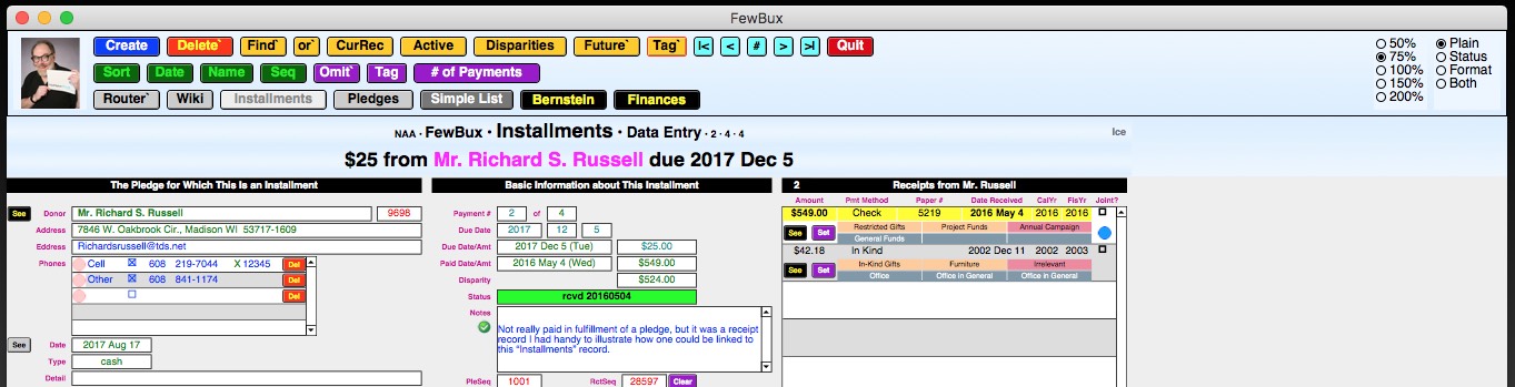
Here it is with the rest of the layout zoomed out to 75%:
Here it is zoomed in to 150%:

Normal zoom but with window narrowed and most of it scrolled toward the right:

And here with normal width but shortened vertically and scrolled down:

Output Screens
Top navigation is of particular value on output layouts, where I always had to try to cram non-printable buttons into the top margin of the page while dodging around printable text. This was particularly true of label layouts, where the top margin was only half an inch, and I needed half of that for the page title, so I had to string things out horizontally:

In the above image, the red line shows the right edge of the 8½×11 printable page as seen in Browse mode, and the green line shows how much farther I had to extend the layout to get all the buttons and explanations to fit. Of course, none of those showed in Preview mode, which showed things as the same width they'd appear on the printed page:

But look how much more compact things become due to the added vertical elbow room made available by the top-navigation part. Now even in Browse mode you get a good visual feel for how wide the output will be:

In Preview mode, of course, it looks exactly the same as before.
And now I'm able to add design elements for which I never previously had any space, such as the table name, aqua navigation buttons, and a text reminder of what kind of labels to use. Of greatest value is space for the new purple "?" (help) button and the 3 adjacent fields that it explains:
- Header Type (blank, contact person, customized, or the word "Principal" for schools)
- Custom Header Text (where, if the "Header Type" was "Custom", you could enter things like "To the parents of")
- Covivant Preference ("Single" for just the name of the person on that record or "Joint" if that person's covivant should be included as well)
ReplyDeleteشركة كشف تسربات الغاز بالقصيم