UPDATE: As of 2013 Dec. 3, FileMaker Pro Version 13 is available, so old ".FP7" files are now even more out of date than before.
FileMaker Inc. (FMI) released FileMaker Pro (FMP) Version 7 in 2004. That was the one that created files with the ".FP7" extension. Among other virtues, it allowed us to pack multiple database tables into a single file. It was also tremendously robust. It was usable not only by Version 7 but also Versions 8, 8.5, 9, 10, and 11. Thus, as the user interface became more versatile, powerful, and user-friendly, the underlying file structure stayed rock-solid, and files created back in the mid-oh-ohs continued to be usable right up to the present. Frankly, it spoiled us, because it looked like it might last forever.
But computer years are like dog years, the ".FP7" file format finally ran its course, and the good folx at FMI needed to move on, particularly given the explosion of hand-held devices (iPad, iPhone, iPod Touch), which were barely a gleam in Steve Jobs's eye back in 2004 and which ".FP7" databases weren't really able to deal with. Thus, in April of 2012, after an unusually long delay following the release of Version 11 in 2010, FMI announced not only a new version (12) of the FMP software but also a new standard for the file structure, called ".fmp12".
Older ".FP7" databases could be converted (quite easily, in fact) to the new ".fmp12" format, but those created natively by FMP 12 weren't backward compatible; they could only be used by FMP 12 (and, eventually, 13, 14, etc.).
So about half my users jumped on board, upgraded their software, converted their files, and kept right on chugging along with the new, enhanced FileMaker Pro. The other half stuck with the older ".FP7" files, since they didn't really need the new features. And this was fine with me for awhile. I was perfectly willing to continue to support the older files, since I'd been doing it all along and couldn't, in all honesty, get everyone converted over all at once in any event.
But it's been a year now, and I've spent a goodly chunk of that year exploring some of the new capabilities within the ".fmp12" file structure and coming up with new standards that I've been installing in the ".fmp12" files I'm supporting. Older ".FP7" files aren't getting those features, and they're lagging further and further behind their brethren. It's not worth my time to do dual-track development even for those features that can be supported under ".FP7", since I've already done the work once for the ".fmp12" format, and I'd much rather work on something new than on repeating the same work under the older system for a dwindling client base.
At the same time, while the ".FP7" files haven't been advancing, they still require the occasional tweak and kick, and I haven't wanted to leave my users in the lurch, especially since I recognize that upgrading the FMP software to Version 12 is a cost item that they may not have budgeted for. But now I'm running into needed (or requested) changes to ".FP7" files that wouldn't have been necessary had they been equipped with the features that I'm making standard with ".fmp12" files, and again I have to question what's the best use of my own time.
So, in order to give everyone time to adjust, I am herewith announcing that, as of 2013 Dec. 31, I will cease supporting systems that use the ".FP7" file format. I will gladly pick up that torch again for the sole purpose of converting such systems to the ".fmp12" format, but I won't be working with ".FP7" any more after that date. That should give you plenty of time to acquire the latest version of the vanilla FMP or FMP Advanced software and get it installed on your system. Let me know if I can be of any help.
2013/04/09
Follow This Blog by E-Mail
In the upper right corner of this blog you will find a box that enables you to enter your e-mail address and go thru about 15 seconds worth of additional clicking on yesses and OKs to sign up to receive an e-mail message every time something's posted to this blog, which will be rarely.
2013/04/01
Changes to the "Universal" File
The Universal file contains the basic information about your organization: its name, logos, address, phone, eddress, website, etc. Up till now, there was just enuf of this information that it couldn’t fit conveniently on a single page, so we used 2 separate data-entry screens — General and Stationery — to accommodate it all.
Well, with the advent of wider computer monitors and the availability within FileMaker Pro of tabbed subscreens, we can now get the whole works onto a single screen (click to enlarge):

General information appears down the left side, while the right side contains 4 tabs:
There are also several new features in the Universal file.
There’s now a Motto field where you can enter a single-line slogan, statement of purpose, aspiration, or boast. Like everything else in Universal, once you’ve entered it there, it’s available everywhere else in your system.
The basic address-component fields have also undergone an expansion. This is what they used to look like:

We’d pre-assemble these components into 2 ready-made fields — Address Oneline and Address Multiline — that were available thruout the database system:

Well, it turns out that this didn’t address all situations, so now we’re looking at a few more components and a few new ways of assembling them. In particular, we didn’t allow for the possibility that a post-office box (mailing) address might have a different zip code, or even a different city, than the physical (shipping) address. So now we’ve made the distinction explicit:

As indicated by the blue-green color of the mailing-address components, each of those values is auto-entered to be identical to what you type into the corresponding shipping-address component. You can, of course, change it thereafter if appropriate.
We still pre-assemble these components into 2 ready-made fields — Address Oneline and Address Multiline — that present both types of address (non-redundantly if there’s duplication), but in addition we provide you with 2 new pre-assembled fields — Address Ship and Address Mail — for those occasions when you very specifically want exactly that.
In addition, 3 more consolidated fields — Letterhead, Contact Info Medium, and Contact Info Wide — continue to be available for use elsewhere. But now you can initially fill these with a reasonable guess at what you’d like by clicking the Guess button. Immediately thereafter you can customize the information to make it fit more neatly or to add more info that’s not part of your standard address components.

Well, with the advent of wider computer monitors and the availability within FileMaker Pro of tabbed subscreens, we can now get the whole works onto a single screen (click to enlarge):

General information appears down the left side, while the right side contains 4 tabs:
- “Stationery”, the frontmost tab, contains what used to be on the old “Stationery” screen.
- “Logos and Finance” contains the 4 container fields for logos as well as 2 fields — Generic Benefits and Sales Tax Rate — with financial implications.
- “Org Picker” is new. It lets you (well, me, really) jump to the organization you want to work with. That’s because, to make life simpler for myself, I’m now including base data for all my client organizations right within this single file. You’ll probably never need to use this tab.
- “Agents” is also new. It lets you jump directly to the person you want in the Agents table.
There are also several new features in the Universal file.
There’s now a Motto field where you can enter a single-line slogan, statement of purpose, aspiration, or boast. Like everything else in Universal, once you’ve entered it there, it’s available everywhere else in your system.
The basic address-component fields have also undergone an expansion. This is what they used to look like:

We’d pre-assemble these components into 2 ready-made fields — Address Oneline and Address Multiline — that were available thruout the database system:

Well, it turns out that this didn’t address all situations, so now we’re looking at a few more components and a few new ways of assembling them. In particular, we didn’t allow for the possibility that a post-office box (mailing) address might have a different zip code, or even a different city, than the physical (shipping) address. So now we’ve made the distinction explicit:

As indicated by the blue-green color of the mailing-address components, each of those values is auto-entered to be identical to what you type into the corresponding shipping-address component. You can, of course, change it thereafter if appropriate.
We still pre-assemble these components into 2 ready-made fields — Address Oneline and Address Multiline — that present both types of address (non-redundantly if there’s duplication), but in addition we provide you with 2 new pre-assembled fields — Address Ship and Address Mail — for those occasions when you very specifically want exactly that.
In addition, 3 more consolidated fields — Letterhead, Contact Info Medium, and Contact Info Wide — continue to be available for use elsewhere. But now you can initially fill these with a reasonable guess at what you’d like by clicking the Guess button. Immediately thereafter you can customize the information to make it fit more neatly or to add more info that’s not part of your standard address components.

2013/03/15
Standard Window Sizing and Zooming
Back when computer monitors were small, we wanted FileMaker Pro windows to be as big as possible, so I set them all to “maximize”, so they’d entirely fill your computer screen, completely covering up everything else (including other FMP windows).
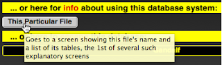
Well, now that computer displays have expanded, that just seems greedy. OTOH, there are times when you really do want a particular file maximized. You’ve always had manual control over window size and shape, of course, but you don’t want to have to be doing it every time you switch to a different layout. So now, for each individual file, you can customize window sizing and zooming to your preferences. You get to the control settings from each file’s Router (welcome) screen, by clicking for info on This Particular File, followed by a couple of clicks on the "next page" arrow:
Standard Window. You can specify what you’d like the standard window to look like. These are your options:

As you navigate to each window in a file, its size will be set to the preference you've specified:

Use the red dot to close the window altogether, the yellow dot to minimize it, and the green dot to toggle between maximized and previous size.
Standard Zoom. Similarly, you can specify what you’d like the standard zoom factor to be. These are your options:

As you navigate to each window in this file, its magnification factor will be set to the preference you've specified. You can also change these zoom factors manually or via a script. In addition, you can manually choose 3 other settings: 25%, 300%, or 400%.
Manual controls are in the lower left corner:

Use – to zoom smaller or + to zoom larger. Click on the number to toggle between 100% and whatever your previous zoom factor was.
Do It Now. You should do this for every individual file in your system. If other people also use these files, get some kind of consensus before you arrive at your standard settings.
Well, now that computer displays have expanded, that just seems greedy. OTOH, there are times when you really do want a particular file maximized. You’ve always had manual control over window size and shape, of course, but you don’t want to have to be doing it every time you switch to a different layout. So now, for each individual file, you can customize window sizing and zooming to your preferences. You get to the control settings from each file’s Router (welcome) screen, by clicking for info on This Particular File, followed by a couple of clicks on the "next page" arrow:

Standard Window. You can specify what you’d like the standard window to look like. These are your options:

As you navigate to each window in a file, its size will be set to the preference you've specified:
- Maximize expands it to fill your entire computer screen.
- Resize to Fit shrinks it so that it’s just big enuf for its contents.
- Restore resets it to whatever size you had previously set it at.
- Hide makes the window vanish from your screen altogether. Bring it back by choosing “Show Window” from the “Window” menu.
- Minimize shrinks the window down to a minimal placeholder in your dock. Bring it back by clicking on that icon.

Use the red dot to close the window altogether, the yellow dot to minimize it, and the green dot to toggle between maximized and previous size.
Standard Zoom. Similarly, you can specify what you’d like the standard zoom factor to be. These are your options:

As you navigate to each window in this file, its magnification factor will be set to the preference you've specified. You can also change these zoom factors manually or via a script. In addition, you can manually choose 3 other settings: 25%, 300%, or 400%.
Manual controls are in the lower left corner:

Use – to zoom smaller or + to zoom larger. Click on the number to toggle between 100% and whatever your previous zoom factor was.
Do It Now. You should do this for every individual file in your system. If other people also use these files, get some kind of consensus before you arrive at your standard settings.
2013/03/01
Changes to "Tag" and "Obsolete" Buttons
You should be familiar with the following arrangement of housekeeping fields and their associated control buttons, because they appear on every data-entry screen in the database system.

Henceforth the buttons will be treated differently.
Tag Buttons. The Set and Find` buttons next to the Tag box will migrate up to the top of the screen, where they will now be known as Tag and Tag`, respectively.

As before, holding down any modifier key while clicking on Tag` will offer you a chance to clear all found tags.
There are 3 motivations for this transition.
1st, having those buttons right within each individual record falsely implied that they’d only affect that single record, when in fact they affect multiple records, which is what the top-of-the-page buttons normally do.
2nd, the tiny Find` button that affected only the Tag box was too easily confused with the big top-of-the-page button of the same name, which performs general searches.

3rd, in general, gold buttons that do searches are labelled everywhere else by the name of the field they search on, which Tag` will now do too.
Obsolete Buttons. The twin Set and Clear buttons next to the Obsolete field will be replaced by a single context-sensitive button that will read Set if Obsolete is empty ...

... or Clear if it’s got a date in it.

This button does affect only the record it’s in, which is why it appropriately remains there.

Henceforth the buttons will be treated differently.
Tag Buttons. The Set and Find` buttons next to the Tag box will migrate up to the top of the screen, where they will now be known as Tag and Tag`, respectively.
As before, holding down any modifier key while clicking on Tag` will offer you a chance to clear all found tags.
There are 3 motivations for this transition.
1st, having those buttons right within each individual record falsely implied that they’d only affect that single record, when in fact they affect multiple records, which is what the top-of-the-page buttons normally do.
2nd, the tiny Find` button that affected only the Tag box was too easily confused with the big top-of-the-page button of the same name, which performs general searches.

3rd, in general, gold buttons that do searches are labelled everywhere else by the name of the field they search on, which Tag` will now do too.
Obsolete Buttons. The twin Set and Clear buttons next to the Obsolete field will be replaced by a single context-sensitive button that will read Set if Obsolete is empty ...

... or Clear if it’s got a date in it.
This button does affect only the record it’s in, which is why it appropriately remains there.
2010/05/07
VCR-Style Navigation Buttons
Depending on when I last updated the buttons in your database system, you may see navigation buttons in either the old round "picture" style or the new oblong "text" style:

Well, they're both about to become obsolete, because the next generation of navigation buttons will abandon both pictures and text in favor of glyphs, which should be familiar from VCR or DVR controls:

The one that might not ring an immediate bell is the "#" one in the middle. Clicking on that one will let you jump to a particular record in the current found set. For example, if you've found 1000 records and enter "500" there, you'll jump to halfway thru your found set. If you try to enter "2000", it'll snark at you.
As you can tell by hovering your cursor over each button to summon up its tooltip, the "arrow-stop" buttons — "|<" and ">|" — will take you to the first and last records in the found set, respectively. The regular arrow buttons — "<" and ">" — will take you to the next record if you're in Form View (1 record visible at a time) or to the next page if you're in List View (multiple records visible at a time).
Well, they're both about to become obsolete, because the next generation of navigation buttons will abandon both pictures and text in favor of glyphs, which should be familiar from VCR or DVR controls:
The one that might not ring an immediate bell is the "#" one in the middle. Clicking on that one will let you jump to a particular record in the current found set. For example, if you've found 1000 records and enter "500" there, you'll jump to halfway thru your found set. If you try to enter "2000", it'll snark at you.
As you can tell by hovering your cursor over each button to summon up its tooltip, the "arrow-stop" buttons — "|<" and ">|" — will take you to the first and last records in the found set, respectively. The regular arrow buttons — "<" and ">" — will take you to the next record if you're in Form View (1 record visible at a time) or to the next page if you're in List View (multiple records visible at a time).
2009/05/07
Reversed Effect of Tag Button
You’re probably acquainted with how I try to save screen space by giving added powers to some buttons if you hold down a modifier key (except caps lock) while clicking on them. These buttons are indicated by accent marks (`). Below are some examples:

Normal effect: creates new blank record
W/modifier key: duplicates current (existing) record

Normal effect: lets you delete the current record
W/modifier key: lets you delete all records in the current found set

Normal effect: goes to Router (welcome) screen
W/modifier key: goes right past the Router screen to the main data-entry screen for this table

Normal effect: enters Find mode; searches for subset
W/modifier key: finds all records
The pattern here is that the modifier key makes the button do extra work, over and above what it would normally do. But there’s been an exception to this pattern. It’s a button that appears near the various Tag boxes:

Normal effect: finds tagged boxes and offers to clear them out for you
W/modifier key: just finds the tagged boxes and stops
For the sake of consistency (and also because simply finding tagged boxes is probably more common than clearing them and should thus be the default), I’m reversing these effects. Henceforth, you’ll get this instead:

Normal effect: finds tagged boxes
W/modifier key: finds and offers to clear
The button color has changed as well. Gold means Find, which is now the basic function of the button; the orange border means delete or clear, which is now the augmented capability.

Normal effect: creates new blank record
W/modifier key: duplicates current (existing) record

Normal effect: lets you delete the current record
W/modifier key: lets you delete all records in the current found set

Normal effect: goes to Router (welcome) screen
W/modifier key: goes right past the Router screen to the main data-entry screen for this table

Normal effect: enters Find mode; searches for subset
W/modifier key: finds all records
The pattern here is that the modifier key makes the button do extra work, over and above what it would normally do. But there’s been an exception to this pattern. It’s a button that appears near the various Tag boxes:
Normal effect: finds tagged boxes and offers to clear them out for you
W/modifier key: just finds the tagged boxes and stops
For the sake of consistency (and also because simply finding tagged boxes is probably more common than clearing them and should thus be the default), I’m reversing these effects. Henceforth, you’ll get this instead:

Normal effect: finds tagged boxes
W/modifier key: finds and offers to clear
The button color has changed as well. Gold means Find, which is now the basic function of the button; the orange border means delete or clear, which is now the augmented capability.
2008/05/07
Omit Button Enhanced
After you’ve done a Find, you may discover a record you didn’t really want. Hopefully, you're aware that you can just drop it out of your found set by clicking on it (to make it active), then clicking on the Omit button. This does not delete it, it simply reduces your found set by 1 record.
You're probably also aware that I use the accent mark (`) on a button to indicate that you can exaggerate the effects of that button by holding down any modifier key (except caps lock) while clicking on it.
Those 2 practices have now come together, as the Omit button has acquired an accent mark. So now, if you hold down a modifier key while clicking on it, you'll be offered a (refusable) opportunity to drop multiple (sequential) records out of the found set all at once.
Let’s say you’ve got 4214 records in the current table, you’ve found 52 of them, and you’re currently at the 14th one, as indicated by the info line:

You do a modified click on Omit`. This is what you’ll see:
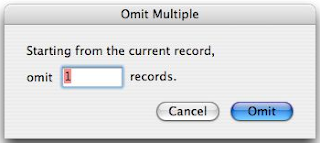
The number 1 is pre-selected for your convenience. If you want to drop, say, the next 12 records (14–25) out of the current found set, just type 12 and press the enter key (or click Omit).
2007/05/07
Button Transition Explanation
Some of the standard buttons that appear at the top of your data-entry screens are about to undergo a metamorphosis. Here's what's up.
The old-style circular buttons, copied right straight out of the sample files provided with earlier versions of FileMaker Pro, looked OK in FileMaker Pro Versions 1-7, but FMP Version 8 renders graphics more meticulously, which means that the square white frame around the button itself now shows up, as does the square white frame around the graphic design that sits on top of the button. This means that these buttons look really ugly in FMP 8.
That was the impetus to get me to do something I've been wanting to do for awhile anyway, namely to (1) reduce the amount of space these buttons take up on the screen and (2) increase the power of each button.
What you see with the 3 buttons above is Phase 1 of what will eventually be a complete transition away from the round "picture" buttons and toward the oblong "text" buttons.
You'll notice the accent marks (``) on a couple of the new buttons. This is where the "more power" part comes in. An accent mark means you can hold down a modifier key to exaggerate the effect of the button. In particular, holding down "Shift" makes "Next" and "Prev" move a screen (rather than a record) at a time, and holding down "Ctrl" or "Alt" jumps all the way to the last or first record. (You get 2 accent marks because there are 2 different ways of exaggerating the effects of these buttons.)

Phase 2 of the transition process is relatively minor. The old circular button, "or / not", is replaced by its exact equivalent, the obloid "or`" button.
As before, this button changes the criteria for a Find operation you've already started with the "Find" button. If you then click just the unmodified "or`" button, it'll add new criteria to the Find request, thereby casting a wider net and probably pulling in more results.
If, however, you hold down any modifier key while clicking the "or`" button, it becomes a "but not" button, restricting the range of things you're looking for and probably pulling in fewer results.

Phase 3 involves sorting. The old circular button used to have 2 functions:
The problem with this, I've discovered, is that you can't tell at a glance which Sort this button would perform for any given page, and it's a nuisance to have to try to remember it for each of several dozen different screens.
Therefore we're separating the 2 functions onto 2 separate buttons:

Phase 4 involves finding. The old circular "Find" button used to have 2 functions:

In addition, there was a separate circular button to Find All records.
As with sorting, you couldn't tell at a glance what Find this button would perform for any given page, and it's a nuisance to have to try to remember it for each of several dozen different screens.
Therefore we're separating the 2 functions onto 2 separate buttons:
But notice the accent mark on the "Find`" button. That means that holding down a modifier key while clicking on it will exaggerate its effects. In particular, it will find all records, the way the old circular "Find All" button used to.

Phase 5 concludes the functional part of the button transition. Still ahead is rearranging them into their tidy final sequence.
The old circular "Create" button has been replaced with an oblong "Create`" button, which has 2 functions:
The old circular "Delete" button has been replaced with an oblong "Delete`" button, which has 2 functions:
To err on the side of caution (that is, preserving data), the "Delete`" button will not delete anything without giving you a chance to change your mind.
Note that the "Delete`" button also works in Find mode, enabling you to delete an unwanted request from your search criteria.
To summarize, here's what you're used to seeing at the top of data-entry screens:

And here's what's coming up at the end of this transition:

The gold "Common" button shown above will have a different name (such as "Members") on every screen. It'll perform a Find for the most common subset of records you want from that screen, the same way the old circular "Find" button used to do. This is consistent with the way the other dedicated gold buttons work.
Likewise, there'll be a new green button (shown above as "Name") to do the most common kind of Sort operation, the way the old circular "Sort" button used to do.
Because these most common Find and Sort operations will have their own dedicated buttons, we'll no longer need the gray "Table" button to tell you what they are.
This means that the "Find`" and "Sort" buttons will now be generic and will work the same way on every screen in every table. The old "Find All" operation will be performed by holding down a modifier key while clicking on "Find`".
The old-style circular buttons, copied right straight out of the sample files provided with earlier versions of FileMaker Pro, looked OK in FileMaker Pro Versions 1-7, but FMP Version 8 renders graphics more meticulously, which means that the square white frame around the button itself now shows up, as does the square white frame around the graphic design that sits on top of the button. This means that these buttons look really ugly in FMP 8.
That was the impetus to get me to do something I've been wanting to do for awhile anyway, namely to (1) reduce the amount of space these buttons take up on the screen and (2) increase the power of each button.
What you see with the 3 buttons above is Phase 1 of what will eventually be a complete transition away from the round "picture" buttons and toward the oblong "text" buttons.
You'll notice the accent marks (``) on a couple of the new buttons. This is where the "more power" part comes in. An accent mark means you can hold down a modifier key to exaggerate the effect of the button. In particular, holding down "Shift" makes "Next" and "Prev" move a screen (rather than a record) at a time, and holding down "Ctrl" or "Alt" jumps all the way to the last or first record. (You get 2 accent marks because there are 2 different ways of exaggerating the effects of these buttons.)
Phase 2 of the transition process is relatively minor. The old circular button, "or / not", is replaced by its exact equivalent, the obloid "or`" button.
As before, this button changes the criteria for a Find operation you've already started with the "Find" button. If you then click just the unmodified "or`" button, it'll add new criteria to the Find request, thereby casting a wider net and probably pulling in more results.
If, however, you hold down any modifier key while clicking the "or`" button, it becomes a "but not" button, restricting the range of things you're looking for and probably pulling in fewer results.
Phase 3 involves sorting. The old circular button used to have 2 functions:
- If you just clicked on it, it would perform whatever Sort was most commonly desired for the page you were on.
- If you held down a modifier key while clicking on it, it would go into FileMaker's generic Sort mode and let you specify your own sorting criteria.
The problem with this, I've discovered, is that you can't tell at a glance which Sort this button would perform for any given page, and it's a nuisance to have to try to remember it for each of several dozen different screens.
Therefore we're separating the 2 functions onto 2 separate buttons:
- Henceforth the most commonly desired Sort order will have its own green button, clearly labelled with a word like "Name" or "Amount", that's pre-set-up to sort by that factor.
- The obloid "Sort" button that takes the place of the old round one will just put you in FileMaker's generic Sort mode; holding down a modifier key while clicking on "Sort" won't do anything different. (Notice that there's no accent mark on "Sort".)
Phase 4 involves finding. The old circular "Find" button used to have 2 functions:
- If you just clicked on it, it would perform whatever Find was most commonly desired for the page you were on.
- If you held down a modifier key while clicking on it, it would go into FileMaker's generic Find mode and let you specify your own search criteria.
In addition, there was a separate circular button to Find All records.
As with sorting, you couldn't tell at a glance what Find this button would perform for any given page, and it's a nuisance to have to try to remember it for each of several dozen different screens.
Therefore we're separating the 2 functions onto 2 separate buttons:
- Henceforth the most commonly desired Find will have its own gold button, clearly labelled with a word like "Members" or "Pickable", that's pre-set-up to find that particular subset of records.
- The obloid "Find`" button that takes the place of the old round one will just put you in FileMaker's generic Find mode.
But notice the accent mark on the "Find`" button. That means that holding down a modifier key while clicking on it will exaggerate its effects. In particular, it will find all records, the way the old circular "Find All" button used to.
Phase 5 concludes the functional part of the button transition. Still ahead is rearranging them into their tidy final sequence.
The old circular "Create" button has been replaced with an oblong "Create`" button, which has 2 functions:
- If you just click on it, it will create a new record (possibly after asking you for some advance information).
- If you held down a modifier key while clicking on it, it will create a duplicate record, a copy of the current record.
The old circular "Delete" button has been replaced with an oblong "Delete`" button, which has 2 functions:
- If you just click on it, it will give you the chance to delete the current record.
- If you held down a modifier key while clicking on it, it will give you the chance to delete all records in the current found set.
To err on the side of caution (that is, preserving data), the "Delete`" button will not delete anything without giving you a chance to change your mind.
Note that the "Delete`" button also works in Find mode, enabling you to delete an unwanted request from your search criteria.
To summarize, here's what you're used to seeing at the top of data-entry screens:

And here's what's coming up at the end of this transition:

The gold "Common" button shown above will have a different name (such as "Members") on every screen. It'll perform a Find for the most common subset of records you want from that screen, the same way the old circular "Find" button used to do. This is consistent with the way the other dedicated gold buttons work.
Likewise, there'll be a new green button (shown above as "Name") to do the most common kind of Sort operation, the way the old circular "Sort" button used to do.
Because these most common Find and Sort operations will have their own dedicated buttons, we'll no longer need the gray "Table" button to tell you what they are.
This means that the "Find`" and "Sort" buttons will now be generic and will work the same way on every screen in every table. The old "Find All" operation will be performed by holding down a modifier key while clicking on "Find`".
Subscribe to:
Posts (Atom)