2018/11/14 — Card Windows
2017/09/17 — Revised Appearance Controls
2017/09/14 — Top Navigation Part
2017/09/13 — Improved Help Buttons
2017/09/12 — New Calculator Button
2015/02/15 — Dealing with Color Blindness
2014/03/21 — Wikify Your Databases (Rev. 2015/08/04)
2014/03/03 — Remote Notes
2014/02/15 — Custom Checkbox Farewell
2014/02/07 — New Prefix and Suffix Technique
2014/02/06 — New Signature Options
2013/04/19 — My Support for “.FP7” Files Ends 2013 Dec. 31
2013/04/09 — Follow This Blog by E-Mail
2013/04/01 — Changes to the “Universal” File
2013/03/15 — Standard Window Sizing and Zooming
2013/03/01 — Changes to “Tag” and “Obsolete” Buttons
2010/05/07 — VCR-Style Navigation Buttons
2009/05/07 — Reversed Effect of Tag Button
2008/05/07 — Omit Button Enhanced
2007/05/07 — Button Transition Explanation
2018/11/14
Card Windows
A relatively new feature in FileMaker Pro is the card window. It opens up over your current window, which remains (dimmed) in the background. Card windows are useful for entering small amounts of information that will be of value when you return to your main window.
For example, on many output layouts I have a button called "Subtitle". It lets you create a customized subtitle for that particular printout. In the past, clicking on "Subtitle" has taken you to a separate screen where you could enter the subtitle you wanted, then click on a "Return" button to go back to the screen you came from. Henceforth, however, clicking on the "Subtitle" button will bring up a card window like this:

After you've entered your preferred subtitle, simply click on the circled X in the upper-left corner to close the card and see your original screen again.
In some cases, there may be action buttons at the bottom of a card window, and clicking on one of them may close the card automatically for you.
For example, on many output layouts I have a button called "Subtitle". It lets you create a customized subtitle for that particular printout. In the past, clicking on "Subtitle" has taken you to a separate screen where you could enter the subtitle you wanted, then click on a "Return" button to go back to the screen you came from. Henceforth, however, clicking on the "Subtitle" button will bring up a card window like this:
After you've entered your preferred subtitle, simply click on the circled X in the upper-left corner to close the card and see your original screen again.
In some cases, there may be action buttons at the bottom of a card window, and clicking on one of them may close the card automatically for you.
2017/09/17
Revised Appearance Controls
You may recall seeing these control buttons in the lower-left corner of your FileMaker Pro windows:

None of those clickables are there any more in FileMaker Pro Version 16.
To take their place, I’ve established 3 appearance controls, 2 of which are available at the far right of most data-entry screens:

Let's look at those 2 in close-up:
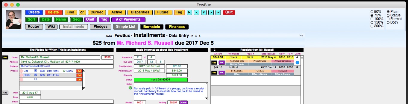
That’s the Zoom control on the left; it works the way it always has, by letting you specify the magnification factor with the click of a button (in this case, a radio button). The View control, on the right, will bring into view either the status bar, the formatting bar, both, or neither (plain).
The 3rd appearance control, Window, determines how windows will be sized as you navigate to them. Unlike Zoom and View, it’s not shown on your data-entry screens. Instead, you need to go to the Router screen, click on info about “This Particular File” and page forward until you get to this screen:

Whatever value is set for each file on the host computer will automatically be in effect for each guest user who opens that file over the local area network (LAN). However, each such user can thereafter independently control the Window setting on her or his machine without affecting anyone else.
I’m toying with the idea of making the Window control, too, available on each data-entry screen. Let me know what you think in the comment area below.
- The first 3 (100, –, and +) controlled the zoom. You clicked on + to zoom in or – to zoom out, and the number showed you the magnification factor.
- The box with the gray bar on top allowed you to toggle the top-of-the-screen status bar on or off.
- And of course the drop-down menu (shown here with “Browse” selected) let you specify which mode you wanted to be in. (You were also able to do so from the View menu or by using the keyboard shortcuts ⌘-B, ⌘-F, ⌘-L, or ⌘-U, respectively.)
None of those clickables are there any more in FileMaker Pro Version 16.
To take their place, I’ve established 3 appearance controls, 2 of which are available at the far right of most data-entry screens:
Let's look at those 2 in close-up:
That’s the Zoom control on the left; it works the way it always has, by letting you specify the magnification factor with the click of a button (in this case, a radio button). The View control, on the right, will bring into view either the status bar, the formatting bar, both, or neither (plain).
The 3rd appearance control, Window, determines how windows will be sized as you navigate to them. Unlike Zoom and View, it’s not shown on your data-entry screens. Instead, you need to go to the Router screen, click on info about “This Particular File” and page forward until you get to this screen:
Whatever value is set for each file on the host computer will automatically be in effect for each guest user who opens that file over the local area network (LAN). However, each such user can thereafter independently control the Window setting on her or his machine without affecting anyone else.
I’m toying with the idea of making the Window control, too, available on each data-entry screen. Let me know what you think in the comment area below.
2017/09/14
Top Navigation Part
New Home for Buttons
I've always put action buttons at the top of the screen, where they're easy to find. But they always had to go into a layout part that was primarily intended for some other purpose (such as display for the header part or data entry for the body part). Now FileMaker has made available a new type of layout part called "top navigation", which is the natural home for buttons. Here's where you'll find it on data-entry screens, right below the status and formatting bars:

Unlike the rest of your layout parts (header, sub-summary, body, footer, trailing grand summary, etc.), the top navigation part does not zoom, scroll, or print. It stays exactly the same size in exactly the same reliable position (at the top left of the window) no matter what you do elsewhere.
Input Screens
Here's what a data-entry screen looks like normally:

Here it is with the rest of the layout zoomed out to 75%:
Here it is zoomed in to 150%:

Normal zoom but with window narrowed and most of it scrolled toward the right:
And here with normal width but shortened vertically and scrolled down:

Output Screens
Top navigation is of particular value on output layouts, where I always had to try to cram non-printable buttons into the top margin of the page while dodging around printable text. This was particularly true of label layouts, where the top margin was only half an inch, and I needed half of that for the page title, so I had to string things out horizontally:

In the above image, the red line shows the right edge of the 8½×11 printable page as seen in Browse mode, and the green line shows how much farther I had to extend the layout to get all the buttons and explanations to fit. Of course, none of those showed in Preview mode, which showed things as the same width they'd appear on the printed page:

But look how much more compact things become due to the added vertical elbow room made available by the top-navigation part. Now even in Browse mode you get a good visual feel for how wide the output will be:

In Preview mode, of course, it looks exactly the same as before.
And now I'm able to add design elements for which I never previously had any space, such as the table name, aqua navigation buttons, and a text reminder of what kind of labels to use. Of greatest value is space for the new purple "?" (help) button and the 3 adjacent fields that it explains:
I've always put action buttons at the top of the screen, where they're easy to find. But they always had to go into a layout part that was primarily intended for some other purpose (such as display for the header part or data entry for the body part). Now FileMaker has made available a new type of layout part called "top navigation", which is the natural home for buttons. Here's where you'll find it on data-entry screens, right below the status and formatting bars:
Unlike the rest of your layout parts (header, sub-summary, body, footer, trailing grand summary, etc.), the top navigation part does not zoom, scroll, or print. It stays exactly the same size in exactly the same reliable position (at the top left of the window) no matter what you do elsewhere.
Input Screens
Here's what a data-entry screen looks like normally:

Here it is with the rest of the layout zoomed out to 75%:
Here it is zoomed in to 150%:

Normal zoom but with window narrowed and most of it scrolled toward the right:
And here with normal width but shortened vertically and scrolled down:

Output Screens
Top navigation is of particular value on output layouts, where I always had to try to cram non-printable buttons into the top margin of the page while dodging around printable text. This was particularly true of label layouts, where the top margin was only half an inch, and I needed half of that for the page title, so I had to string things out horizontally:
In the above image, the red line shows the right edge of the 8½×11 printable page as seen in Browse mode, and the green line shows how much farther I had to extend the layout to get all the buttons and explanations to fit. Of course, none of those showed in Preview mode, which showed things as the same width they'd appear on the printed page:
But look how much more compact things become due to the added vertical elbow room made available by the top-navigation part. Now even in Browse mode you get a good visual feel for how wide the output will be:
In Preview mode, of course, it looks exactly the same as before.
And now I'm able to add design elements for which I never previously had any space, such as the table name, aqua navigation buttons, and a text reminder of what kind of labels to use. Of greatest value is space for the new purple "?" (help) button and the 3 adjacent fields that it explains:
- Header Type (blank, contact person, customized, or the word "Principal" for schools)
- Custom Header Text (where, if the "Header Type" was "Custom", you could enter things like "To the parents of")
- Covivant Preference ("Single" for just the name of the person on that record or "Joint" if that person's covivant should be included as well)
2017/09/13
Improved Help Buttons
I've been using little purple "?" buttons to indicate that help is available for whatever's nearby:

Clicking on the button would bring up a dialog box:

But the default size for the dialog box was limited, so if the text of the help message was extensive, I had to break it up into a series of installments, and you had to keep clicking on "More" buttons until you finally got to the last one, when you could get back to work by clicking on "OK":

And you had to go thru them all, even if you'd learned everything you needed to know after the first 1 or 2. Furthermore, I was limited to only one font at one size and could only emphasize things by using ALL CAPS. And there was no way to include pictures to illustrate what I was trying to explain.
Enter the popover button. It looks the same as before:

But clicking on it opens a whole new style of window:

I've got control over the size and shape of the window as well as its contents. I can put into it not only formatted text but also graphics, data-entry fields, and buttons. I'll be gradually replacing all of the old help buttons with these versatile new ones.
Once you've learned what you need to know, simply close the popover window by clicking anywhere outside it.
Clicking on the button would bring up a dialog box:
But the default size for the dialog box was limited, so if the text of the help message was extensive, I had to break it up into a series of installments, and you had to keep clicking on "More" buttons until you finally got to the last one, when you could get back to work by clicking on "OK":
And you had to go thru them all, even if you'd learned everything you needed to know after the first 1 or 2. Furthermore, I was limited to only one font at one size and could only emphasize things by using ALL CAPS. And there was no way to include pictures to illustrate what I was trying to explain.
Enter the popover button. It looks the same as before:
But clicking on it opens a whole new style of window:
I've got control over the size and shape of the window as well as its contents. I can put into it not only formatted text but also graphics, data-entry fields, and buttons. I'll be gradually replacing all of the old help buttons with these versatile new ones.
Once you've learned what you need to know, simply close the popover window by clicking anywhere outside it.
2017/09/12
New Calculator Button
Heretofore, wherever it seemed like a good idea for my users to have access to a simple 4-function calculator, I'd insert one onto the appropriate screen, like this:

This made it handy and always visible, but only on screens where I had specifically installed it, where it took up valuable real estate. If somebody needed a calculator on some other screen which I hadn't anticipated, they were out of luck.
Well, there's an improved technique available now: floating document windows. These can be opened up with the click of a button (which doesn't take up much screen space), and they stay in the very front of your display, on top of all other windows, until you close them. This is the way I'm now handling the need for a calculator on data-entry screens. Here's what the button looks like:

And here's what the calculator window looks like after you click on it:

Because it's a separate window, you can move it all over the screen so it doesn't cover up the stuff you're working on. You can't resize it, but you can close it, either with the normal red "close window" button supplied by your operating system or the big, obvious, purple "Close This Window" button at the bottom. The purple "C" button at upper left clears all the data fields; "Copy Result" copies the contents of Field 3 (the calculation result) as a pure number onto your clipboard, suitable for pasting into your database; and the iteration-arrow button copies that same number but reinserts it into the top line so you can manipulate it further.
This made it handy and always visible, but only on screens where I had specifically installed it, where it took up valuable real estate. If somebody needed a calculator on some other screen which I hadn't anticipated, they were out of luck.
Well, there's an improved technique available now: floating document windows. These can be opened up with the click of a button (which doesn't take up much screen space), and they stay in the very front of your display, on top of all other windows, until you close them. This is the way I'm now handling the need for a calculator on data-entry screens. Here's what the button looks like:
And here's what the calculator window looks like after you click on it:
Because it's a separate window, you can move it all over the screen so it doesn't cover up the stuff you're working on. You can't resize it, but you can close it, either with the normal red "close window" button supplied by your operating system or the big, obvious, purple "Close This Window" button at the bottom. The purple "C" button at upper left clears all the data fields; "Copy Result" copies the contents of Field 3 (the calculation result) as a pure number onto your clipboard, suitable for pasting into your database; and the iteration-arrow button copies that same number but reinserts it into the top line so you can manipulate it further.
2015/02/15
Dealing with Color Blindness
I myself have ordinary color vision, so I'm not particularly sensitive to color blindness. However, one of the participants in FileMaker Inc.'s Community discussion list, Peter Sijmons of Szienz Software in Leiden, Nederland, develops programs for use by people with disabilities, and he conducted a survey of actual color-blind people to find out what color combinations were easy or hard for them to read. He reports:

Since I make extensive use of color in my own layout designs, I'm going to try to be more cognizant of these concerns in the future.
These may vary on a person-by-person basis, as there are degrees of color blindness, so on the horizontal axis of the standard color palettes it may be hard to see differences, but on the vertical axis (intensity within the same color column) the difference becomes clearer.
So, for example, if you have green and red adjacent fields, make sure you also make a jump in the vertical axis. When the green is 3rd field from the bottom, the adjacent red should be either 2nd or 4th from the bottom. This nuance will be picked up in most cases.
Since I make extensive use of color in my own layout designs, I'm going to try to be more cognizant of these concerns in the future.
2014/03/21
Wikify Your Databases
Revised 2015/08/04
“The job isn’t over until the paperwork is done.” That’s still true even in a paperless age. One really should document one’s work, but that’s usually something that gets put off until the last minute and often ends up being neglected altogether.
Furthermore, it’s notoriously true that software engineers who are perfectly comfortable speaking techie talk to each other might as well be using Swahili when it comes to communicating with end users, which is why there are career opportunities for tech writers who are able to translate between Geekspeak and English.
But nobody’s better at describing to you what you need to know than you yourself. This is particularly true of the rarer activities, such as an annual fund-raising drive or a seasonal performance, where you’ve had plenty of time to forget how you did it the previous go-round. Wouldn’t it be nice if you could easily call up your former self to help you out this year?
Well, we’re working on the next-best thing, which is a wiki. It’s defined on the most famous one of all, Wikipedia, as a tool “which allows people to add, modify, or delete content in collaboration with others. [Typically] the content is created without any defined owner or leader, and wikis have little implicit structure, allowing structure to emerge according to the needs of the users. ... ‘Wiki’ is a Hawaiian word meaning ‘fast’ or ‘quick’.”
That’s certainly true of the ones I’ve begun installing in the one place where you really need a friend, namely right in the database itself, so you don’t have to go rummaging thru your file cabinets or e-mail archives looking for your documentation. Also, and perhaps more importantly, having the wiki right under your fingertips when you’re solving problems makes it easier to document your processes, timelines, “whom to notify”s, etc. as you go along, rather than waiting till the end, when some of your knowledge will already have started to fade.
My wikis are about as super-simple as they can get. I give you a scrollable free-form text field into which you can type anything you want. I make it accessible, point you to it, and walk away. That’s it. The rest is up to you.
My wikis come in 2 basic flavors: file-level and table-level. The file-level wiki will be available on the Router screen, where it’ll appear on the “Documentation” tab, like this:
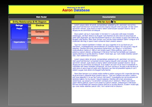
It will typically share that tab with the file’s E-R (entity-relationship) diagram, if it has one. Here's where you'll enter info about the file as a whole, or about aspects of it that involve multiple tables within the file.
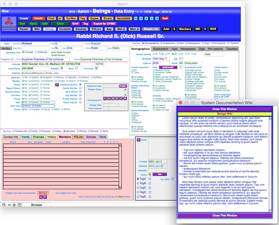
You'll be able to get to a table-level wiki for any given table by means of a "Wiki" button located on that table's data-entry screen, normally right next to the "Router`" button:

An ordinary table-level wiki will initially open up as a floating window near the upper left corner of your screen, like this:

A "floating window" is one that stays on top of your regular windows, so your wiki window will remain visible and attention-getting until you choose to close it. But, if it's covering up something you need to see, just reposition it:
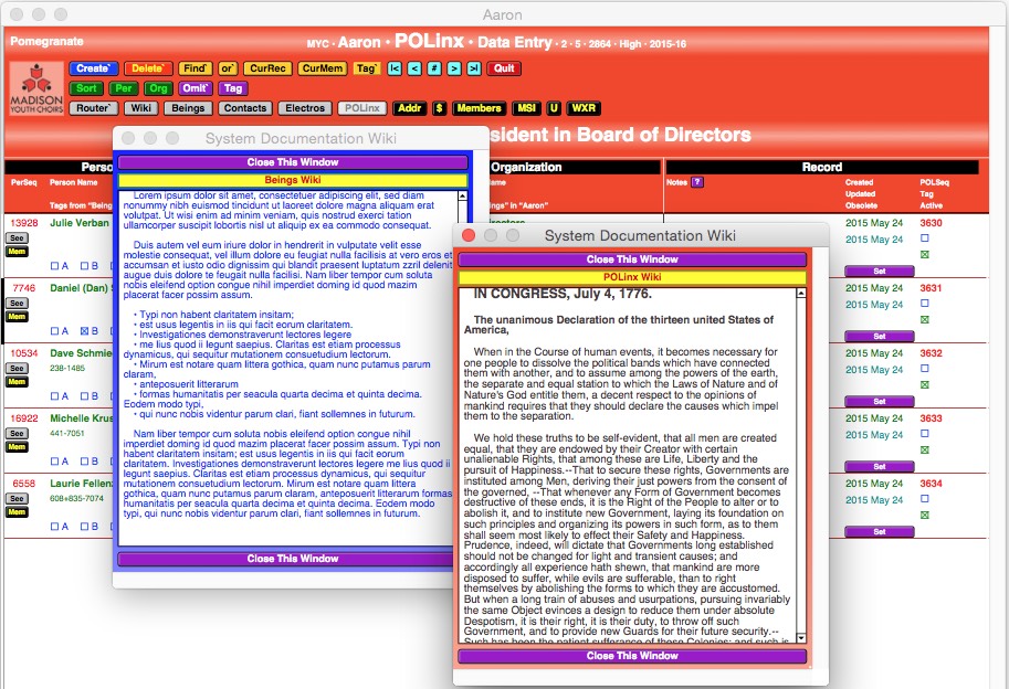
And, altho each wiki is associated with a given table, you aren't stuck having to look at that table while you work with the wiki. You can jump to some other table instead underneath it:

And you can open the wiki from that table as well and have 2 of them floating there simultaneously, allowing you to copy and paste back and forth between them:
Finally, while each wiki opens in a fairly discreet, petite little window, you can resize it to get a better look at what it contains:

Wikis are provided to you as a service to aid in your documentation. Use them or not, as you see fit. If you find that your wiki entries are starting to run on at some length, give some thot to putting an index at the top which would refer to subject headings further down.
Each record in each table also has a "Notes" field, into which you can jot down odd little bits of information about that particular record that don't fit into any of the standard fields. The "Wiki" field applies to the table as a whole, not to any single record within it; otherwise, you can use it in much the same way — for reminders and notes to yourself — if you wish. Generally, tho, it's intended for long-term "how to" writeups.
You know who’s the 2nd most likely (after you) to find your wiki entries useful? New employees. But in their case, by far the more valuable service will go in the opposite direction, not so much their learning from the wiki as their contributing to it! There’s no substitute for a fresh set of eyes using a system for the first time. They’re not handicapped by familiarity. They haven’t become accustomed to all the little inconveniences and inefficiencies that you’ve long ago adjusted to and take for granted. These are the very people who are in the best position to fill in gaps in your wiki that you overlooked because you thot they were “too obvious to write down”.
Take full advantage of the tremendous opportunity your new workers give you. Have them go right straight to the wiki to explain things that they had to figure out for themselves because your documentation was incomplete (or even erroneous).
The wiki is yours, not mine. I’ve got plenty of places where I can describe things from my perspective, including this blog that you’re reading right now, always accessible thru the “Entire Database System” button on the Router screen of your every file:

That same row of “info” buttons will also contain “This Particular File”, which gives you basic data on the file you’re in, following the same multi-page format in every file. It will also occasionally have a “Help” button for information that’s truly unique to that file.
As the above screenshot illustrates, I also make extensive use of pop-up tooltips to provide explanations of buttons and other features. Occasionally, when the explanation would be too long for you to read before the tooltip vanishes again, I give you a little purple “?” button that you can click on to go to a more detailed explanation.

Finally, there are some bits of information that are important to know but which you’re not likely to go looking for on your own. For those I give you always-visible text instructions, like this:

The point of running thru all of my forms of documentation is to emphasize that I am the geek here, and you are the subject expert. You don’t specialize in databases, and I don’t specialize in whatever work you do. What I have to say may not be readily understandable to you, or it may not address concerns that you have that I’m oblivious to. Thus the wiki. It’s yours. It’s a place where you can speak your language to yourself and your co-workers.
Enjoy the conversation.
2014/03/03
Remote Notes
From the outset, virtually every record in every database I've ever created has had a "Notes" field for those odd little tidbits of information that don't seem to fit anywhere else. Such fields are handy for things that are good to know but don't appear systematically thruout an entire table (or at least weren't expected to do so at the time the note was created). And the data-entry screen on which "Notes" appears is usually big and sprawling, using most of the screen for a single record, so there's been elbow room to display a good-sized "Notes" box, and I usually do.
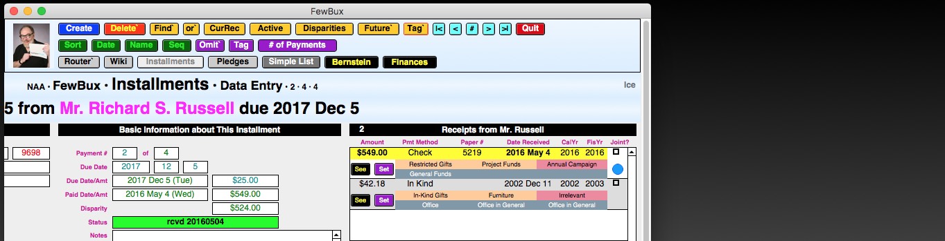
However, when someplace else in the system needs to refer to that record with the note in it, space is usually at a premium, and among the first things not to display in that remote location are the "Notes". Nonetheless, it's often good to know, while you're still in that other table, (a) that there is a note in the related record and (b) what that note says. Heretofore, there's been no good method of doing that other than clicking on the "See" button next to the related record and just going to its table and looking at it. This has been a time-consuming nuisance.
So now what? Now I'm using symbolism. Every new record starts out with nothing at all in the "Notes" field. In that case, the vacuum will be acknowledged by a little pink dot somewhere nearby:

As soon as you type something in, however, the pink dot will change to a green check-marked bullet:

"Big deal," you're probably thinking, "I can just look at the 'Notes' field to see whether there's anything in it." And that's true here, but this is just to get you warmed up to the idea of what those 2 symbols mean. They really start to pay dividends when you're looking at that record on display elsewhere, say in a picker portal in a different table, where you can hover your cursor over the dot to call up otherwise hidden information, like this:

or, most usefully, like this:

However, when someplace else in the system needs to refer to that record with the note in it, space is usually at a premium, and among the first things not to display in that remote location are the "Notes". Nonetheless, it's often good to know, while you're still in that other table, (a) that there is a note in the related record and (b) what that note says. Heretofore, there's been no good method of doing that other than clicking on the "See" button next to the related record and just going to its table and looking at it. This has been a time-consuming nuisance.
So now what? Now I'm using symbolism. Every new record starts out with nothing at all in the "Notes" field. In that case, the vacuum will be acknowledged by a little pink dot somewhere nearby:
As soon as you type something in, however, the pink dot will change to a green check-marked bullet:
"Big deal," you're probably thinking, "I can just look at the 'Notes' field to see whether there's anything in it." And that's true here, but this is just to get you warmed up to the idea of what those 2 symbols mean. They really start to pay dividends when you're looking at that record on display elsewhere, say in a picker portal in a different table, where you can hover your cursor over the dot to call up otherwise hidden information, like this:
or, most usefully, like this:
2014/02/15
Custom Checkbox Farewell
The Big Picture
A Bit of History (optional reading)
What's New in "Events"
How To Create New "Event Links"
How To Create New "Custom Flags"
Mass Data Entry
Finding a Flag
As I've said on many occasions, if you find yourself doing the same thing over and over again, there's probably an easier way.
Well, one thing I've been asked to do repeatedly is create custom checkboxes for certain subsets of records that users frequently need to call up. And these are different for different groups:
- One client has checkboxes for each of its 2 different newsletters plus a 3rd for people on Facebook.
- Another group has checkboxes for different projects that members participate in.
- A 3rd has boxes for "New to Project A", "New to Project B", "Send Postcard", "Sent Postcard", and "Needs Info".
- Yet another has a checkbox for each precinct in its city plus another for residents of a nearby suburb.
While the subject matter differs, the one thing all these users have in common is that they keep coming back for more subsets. Unfortunately, that means they usually have to wait for me to create the additional checkboxes and find a place for them on their layouts, which usually are already pretty tightly packed. And, in addition to the checkboxes themselves, I usually have to create global fields where the users can enter their preferred title for each one.

You'd think there must be a better way, and it turns out there is. All of my systems have a main table called "Beings", in which we store information about people and organizations. And a few of those installations already had a "BELinx" table (short for "being-event links"), which turns out to work almost exactly like a checkbox.
"BELinx" is what's known as a link, join, or merge table. It sits between 2 other tables (in this case "Beings" and "Events") and keeps track of all the legitimate combinations of records from them. For example, it might have a record that points to both Being #1234, Kelly O'Toole, and Event #56, Awards Banquet, along with the info that Kelly is the guest speaker for the banquet. This makes it possible to do a Find for "Awards Banquet" from the "Beings" table or for "Kelly O'Toole" from the "Events" table.

Really, tho, there's no reason why "BELinx" has to link people only to events. We could just as easily create an "Events" record called "Facebook" and link people to that instead of checking a box. It's just a single mouse click in either case. Furthermore, there's a fringe benefit, in that the "BELinx" table automatically remembers when its records were created, so you can tell when somebody was added to your Facebook roster (or, if they should flee screaming from Facebook, when that record went obsolete).
The greatest advantage, tho, is that it puts control over these subsets into the hands of the users — as many as they want, whenever they want — and they can do it all in Browse mode, without ever having to go into Layout mode, define or format new fields, or fiddle with scripts.
So I'm going to be converting a lot of the existing customized checkboxes to this more versatile "BELinx" approach. More details below.
It usually starts innocently enuf. Somebody says "Say, I live in the City of Sugar Maple, Wisconsin. Is there some way I could flag other residents of the city so I know whom to contact to lean on the city council to save Galena Creek?". And I, equally naive, say "Sure, ridiculously easy. We'll just create a checkbox for it." And so it begins:

Now, you may be wondering "Why don't you just have them do a Find in the 'City' field in the address?" 2 reasons: false positives and false negatives. You get a false positive when a resident of the outlying area — say, the Town of Propellor Seed — has an address served by the Sugar Maple post office but doesn't actually live and vote in Sugar Maple. And you get a false negative when you have an actual resident of Sugar Maple who lives in a part of town that butts up against the bigger Badger City and is served by that post office. In short, the post-office city isn't necessarily the same as the municipality of legal residence and can't be used reliably as a proxy for that purpose.
So we're in business with our checkbox. Some time later, however, it's "Hey, we want to be able to have constituents contact their individual city-council members specifically. Can we set up checkboxes for each of the 4 aldermanic districts within Sugar Maple?". And again, I'm all "No prob. We know exactly how to do it." And the burgeoning begins in earnest:

More time goes by. Now we want to lobby the town board of Propellor Seed (which also occupies part of the Galena Creek watershed), so we need to flag their residents. And we've also formed a group called "Friends of Galena Creek", so they get their checkbox as well:

You can see where this is headed, right? Every time the need for some new subset of people arises, it looks like a nail to someone whose only tool is a hammer, and we create a new flag for it. But look how much screen space we're starting to chew up with all those checkboxes. In particular, the 4 Sugar Maple aldermanic districts and the Town of Propellor Seed are geographically disjoint. Nobody will ever live in more than 1 of them at a time. Yet, because we don't know which one, we have to allow for all of them as possibilities.
It wasn't until someone asked "Can we create a checkbox for the people coming to our annual awards banquet?", and I replied "No, that's what the 'Events' table is for." that it dawned on me how similar the 2 processes are. And that's when I resolved to do something about checkbox proliferation, making use of a tool that I already had up and running in many cases.
Previously, the "Events" table kept track of 1 kind of thing — events — so there was no need to specifically say so in each record. But now that it's possible that it may also be tracking subset titles, it's useful to identify which is what. That's why, adjacent to the "Event Type" field, we now have the new "Record Type" field:

Every newly created "Events" record starts off with the assumption that you're dealing with an actual event, so that's what's entered by default in "Record Type", allowing you to go on to supply more details, producing a screen that looks like this:

But, if you set "Record Type" to "Flag", you won't need most of the additional info, so you'll end up with most of the other fields blacked out:

You could, if you wished, still enter information in them, but why?
Notice that the Packer-colored banner at the top of the screen tells you not only the title but also the record type ("Event" or "Flag").
Within the "Beings" table, you will continue to create new "BELinx" records the same way you always have. There will be a list of available events under "Event Picker", ...

... you'll click "Set" on the one you want to link to the current "Beings" record, and the link is forged:

You may still have to manually enter some info, like the role this being will play in the event and the timeframe involved. (This raises the possibility that the same person may be linked to an event more than once. For example, somebody could be running a workshop in the afternoon and be a speaker in the evening, or could be a sponsor for the entire event as well as an award recipient at the banquet. Each of these situations can be reflected in the "Role" field, sometimes in combination with the "Timeframe" field.)
The "Event Picker" portal will show only "Events" records that you have identified as having "Record Type" = "Event". Events you have flagged as "Obsolete" (almost always because they've already happened) get a caramel-colored background and drop to the bottom of the available options. Events that are still active are listed in reverse chronological order, which is how you're most likely to want to see them.
What about "Events" records that you have identified as having "Record Type" = "Flag"? Within the "Beings" table, they (and only they) will show up under the "Flag Picker" portal (usually found on the "Affiliations" tab):

And you'll use that the exact same way you would "Event Picker", by clicking "Set" on the flag you want to associate with the current being, and the link will show up next door under "Custom Flags":

If you set a flag by accident (as with "SMHS Faculty" in the example above), just click on its "Del" button to delete it. (At some future time, there will also be an option to set the link to "Obsolete", which is useful for tracking, for example, when somebody signed off of Facebook.)
As with "Event Picker", "Flag Picker" will deprecate flags identified as "Obsolete" by dropping them to the bottom of the list and giving them a caramel-colored background. However, unlike "Event Picker", items are listed under "Flag Picker" in alphabetical, not chronological, order.
So you've seen how you can flag a particular "Beings" record from the "Flag Picker". But suppose you wanted to do a whole batch of them at once (say right after you've imported the membership list of the Smallmouth Bass Society)? It would be tedious to have to page thru record after record, clicking on "Set" for each of them. Fortunately, there's an easier way, but it's finicky, and you have to make sure you've done things in the right order. The first thing you have to do is a Find within "Beings" for the records you want. (You don't have to call them all up at once; you can do them in batches if that's easier.)
Then go to "Events" and find (or create) the record you want. Let's say it is for the Smallmouth Bass Society. If it's newly created, it will have been set automatically as the default (indicated by the banner's yellow letters on the green background):

If not, it will be shown with white letters, as here:

In this case, you will have to click on the "Set As Default" button to make this the default event.
Now head on over to the "BELinx" data-entry screen, where you will find the "Import" button right next to "Create`":

Click on it, and it will ask you a couple of safety questions before it goes ahead and hauls in all the "Beings" records you want to link to the SBS. You'll have multiple opportunities to back out.
OK, so all of the above has been preparatory to actually finding a subset of records that you've so diligently flagged. As before, you will start by clicking the "Find`" button. And here we get to one of the tradeoffs that are inevitable in the wonderful world of computing. With checkboxes, all you had to do was click in the checkbox and hit "return", and you were off. Not quite so easy here. Now after clicking "Find`" you have to go to the "Custom Flags" portal, which is showing a magnifying glass in your flag-title field ...

... click in that field, and type in the name of what you're looking for:

I predict that you'll get up to about the 3rd time you have to type in "Sugar Maple AD 2" (not counting typos or memory errors such as omitting a space in "AD2") before you start longing for the simplicity of the old checkboxes. Fortunately, a solution is almost at your fingertips. Head on over to the "Events" screen and abbreviate "Sugar Maple" down to just "SM". That'll transform your "Flag Picker" thus:

More to the point, it'll also transform your "Custom Flags" references, so now you only have to search for "SM AD 2", which is easier to type.
But wait, there's more. Suppose you wanted to call up people in all 4 of the Sugar Maple aldermanic districts. You might think that you'd have to do that with a 4-part Find using the "or`" button:

You could, of course. And if you were still using checkboxes, that's what you'd have to do. But now there's an easier way. Just do a Find for "SM AD" (no number), and it'll pull in anything that has that letter combination (that is, anyone in any of the Sugar Maple aldermanic districts).
"Aha!", you're thinking, "I've got the hang of this now. If I want to rope in all residents of Sugar Maple, plus the high-school faculty (some of whom live just outside of town), I can do it by looking for only the letters they have in common." And so you try:

And it seems to have been successful until you start paging thru the found set and run across this guy:

Woops. It turns out that "Smallmouth" also begins with an "sm", so you've got a false positive. But here's where schmartness sets in. You head on back to "Events", find "SMHS Faculty", and insert a strategic space, causing your "Flag Picker" portal to look like this, with "SM HS Faculty" having leapfrogged above "Smallmouth Bass Society" because its 3rd character, a space, sorts ahead of the "a" in "Smallmouth":

And now when you do your Find in "Custom Flags", you do it for a character string enclosed within quotation marks, reflecting your desire for FileMaker to look not for "sm" (only) but for "sm[space]":

With a little practice, you'll get really good at learning how to avoid both false positives and false negatives while minimizing the amount of typing you need to do.
Subscribe to:
Posts (Atom)